
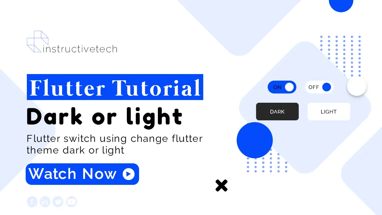
Flutter Dark Theme
You can easily learn how to use the dark mode of your Flutter mobile app using the Flutter switch widget. when the user clicks your flutter switch then dynamically change your flutter theme data. when the boolean value is true then show theme dart. when the boolean value is false then show theme light.
Flutter Switch Widget
 Switch(
              activeColor: Colors.greenAccent,
              value: isSwitched,
              onChanged: (value) {
                setState(() {
                  isSwitched = !isSwitched;
                });
              }),
Flutter Theme Data
theme: isSwitched ? ThemeData.dark() : ThemeData.light(),Read also, Flutter appbar backdrop onpress.
How to use Switch in Flutter
Full tutorial source code:
import 'package:flutter/material.dart';

void main() => runApp(MyApp());

class MyApp extends StatefulWidget {
  @override
  _MyAppState createState() => _MyAppState();
}

@override
class _MyAppState extends State<MyApp> {
  bool isSwitched = false;

  Widget build(BuildContext context) {
    return MaterialApp(
      theme: isSwitched ? ThemeData.dark() : ThemeData.light(),
      debugShowCheckedModeBanner: false,
      home: Scaffold(
        appBar: AppBar(title: Text('Title'), actions: [
          Switch(
              activeColor: Colors.greenAccent,
              value: isSwitched,
              onChanged: (value) {
                setState(() {
                  isSwitched = !isSwitched;
                });
              }),
        ]),
        body: Center(
          child: MyDesign(),
        ),
        drawer: Drawer(
          child: Column(
            children: [
              UserAccountsDrawerHeader(
                margin: EdgeInsets.all(0.0),
                accountName: Text('Instructive Tech'),
                accountEmail: Text('[email protected]'),
                currentAccountPicture: CircleAvatar(
                  backgroundImage: NetworkImage(
                      'https://scontent.fdac34-1.fna.fbcdn.net/v/t39.30808-6/271190257_281054324087750_6540061642459300040_n.jpg?_nc_cat=104&ccb=1-5&_nc_sid=09cbfe&_nc_eui2=AeFttG8HoFhQR66PER8P1qlCmYLMf-XZ-6eZgsx_5dn7p_GuyzigLxTlWB6hG8P9_Xyl-vNoVRcDCM4TC4Cq0-OQ&_nc_ohc=AEZU2a_wVEgAX-GrhuG&_nc_zt=23&_nc_ht=scontent.fdac34-1.fna&oh=00_AT8k_MqY1MK22Uyis0AYbw6tmMVMs4_hkAIiuHexRT2jhg&oe=620911D4'),
                ),
                currentAccountPictureSize: Size(60, 60),
              ),
              ListTile(
                title: Text('This is Titel'),
                subtitle: Text('Subtitle'),
                leading: Icon(Icons.home),
              ),
              ListTile(
                title: Text('This is Titel'),
                subtitle: Text('Subtitle'),
                leading: Icon(Icons.account_box_outlined),
              ),
              ListTile(
                title: Text('This is Titel'),
                subtitle: Text('Subtitle'),
                leading: Icon(Icons.info),
              ),
            ],
          ),
        ),
      ),
    );
  }
}

class MyDesign extends StatefulWidget {
  const MyDesign({Key? key}) : super(key: key);

  @override
  _MyDesignState createState() => _MyDesignState();
}

class _MyDesignState extends State<MyDesign> {
  @override
  Widget build(BuildContext context) {
    return Container();
  }
}
Animated switcher flutter
AnimatedSwitcher is a widget that enables you to perform a cross-fade between two given children. This is especially useful when you want to animate between widgets that do not have a common origin.
Read Also, the Flutter Liquied Swipe animation example.
Here’s a simple example of how to use AnimatedSwitcher in Flutter:
import 'package:flutter/material.dart';

void main() {
  runApp(const MyApp());
}

class MyApp extends StatelessWidget {
  const MyApp({Key? key}) : super(key: key);

  @override
  Widget build(BuildContext context) {
    return MaterialApp(
      home: Scaffold(
        appBar: AppBar(
          title: const Text('AnimatedSwitcher Example'),
        ),
        body: Center(
          child: const MyHomePage(),
        ),
      ),
    );
  }
}

class MyHomePage extends StatefulWidget {
  const MyHomePage({Key? key}) : super(key: key);

  @override
  _MyHomePageState createState() => _MyHomePageState();
}

class _MyHomePageState extends State<MyHomePage> {
  bool _toggle = true;

  @override
  Widget build(BuildContext context) {
    return Column(
      mainAxisAlignment: MainAxisAlignment.center,
      children: <Widget>[
        AnimatedSwitcher(
          duration: const Duration(seconds: 1),
          transitionBuilder: (Widget child, Animation<double> animation) {
            return ScaleTransition(child: child, scale: animation);
          },
          child: _toggle
              ? Icon(Icons.lightbulb, key: UniqueKey(), size: 100)
              : Icon(Icons.lightbulb_outline, key: UniqueKey(), size: 100),
        ),
        SizedBox(height: 20),
        ElevatedButton(
          child: const Text('Toggle'),
          onPressed: () {
            setState(() {
              _toggle = !_toggle;
            });
          },
        ),
      ],
    );
  }
}
Conclusion
In conclusion, the Flutter Switch for implementing a dark theme is an exceptional tool that allows developers to create a more customizable and user-friendly application interface. The dark theme not only provides visual comfort to users in low-light conditions but also enhances the overall user experience by providing an additional layer of customization. The implementation of a dark theme in Flutter using the Switch widget is straightforward and efficient, making it an advantageous feature for developers to leverage in their applications. As an open-source UI toolkit, Flutter continues to demonstrate its versatility and effectiveness, with its dark theme implementation being a prime example of its flexibility and user-centric approach.