
Flutter app development has revolutionized the way mobile applications are created. With its reactive framework and robust widget catalog, Flutter makes it possible to create highly responsive and dynamic user interfaces that can adapt to different screen sizes seamlessly.
Tips For Flutter app Responsive
Flutter provides various tools and techniques to ensure that the app’s layout remains consistent and visually appealing across multiple devices. Here’s how Flutter app development ensures responsive design for different screen sizes:
- Flexible Widgets: Flutter offers flexible widgets, which allow developers to create user interfaces that can adjust their size and position dynamically. This means that widgets can expand or shrink based on the screen size without compromising the app’s functionality or visual appeal.
- MediaQuery: Flutter’s MediaQuery class allows developers to access information about the device’s screen size, orientation, and resolution. This information can be used to create layout rules that adjust the app’s design based on the device’s specifications.
- Responsive Layouts: Flutter’s layout system enables developers to create responsive designs that automatically adjust to different screen sizes. With the help of widgets like Row and Column, developers can create layouts that adjust their size and positioning based on the device’s screen size.
- Design Guidelines: Flutter has well-defined design guidelines that help developers create consistent and visually appealing user interfaces. These guidelines provide recommendations for typography, color schemes, and layout, ensuring that the app looks great on all devices.
Learn about Flutter InteractiveViewer Widget.
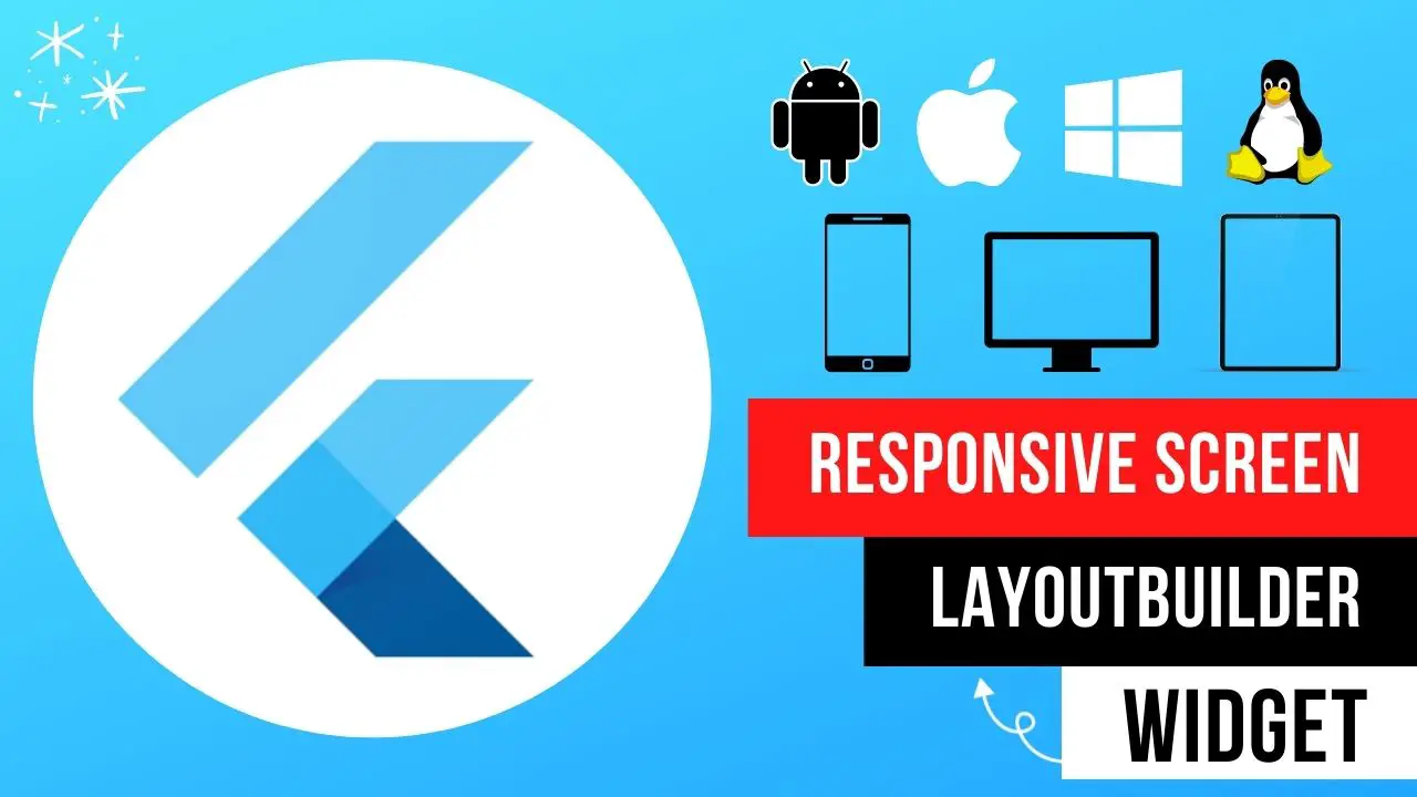
How to make the flutter app responsive according to different screen sizes
How to make the flutter app responsive according to different screen sizes? Flutter responsive Desktop Screen, Tablet Screen, and mobile Screen using LayoutBuilder Widget.
LayoutBuilder(
        builder: (BuildContext contex, BoxConstraints constrains) {
      if (constrains.maxWidth >= 1440) {
        return Container(
            color: Colors.green,
            alignment: Alignment.center,
            child: const Text(
              "Desktop Screen",
              style: TextStyle(
                fontWeight: FontWeight.w800,
                fontSize: 35,
              ),
            ));
      } else if (constrains.maxWidth < 1440 && constrains.maxWidth > 480) {
        return Container(
            color: Colors.red,
            alignment: Alignment.center,
            child: const Text(
              "Tablet Screen",
              style: TextStyle(
                fontWeight: FontWeight.w800,
                fontSize: 35,
              ),
            ));
      } else {
        return Container(
            color: Colors.blue,
            alignment: Alignment.center,
            child: const Text(
              "Mobile Screen",
              style: TextStyle(
                fontWeight: FontWeight.w800,
                fontSize: 35,
              ),
            ));
        // Wow Working it better.... if you like please SUBSCRIBE and hit like button..
        // Code link in the descripiton.... thanks for watching.....
      }
    });
Flutter responsive app example
Tutorial source code:
import 'dart:math';

import 'package:flutter/material.dart';
import 'package:flutter/rendering.dart';

main() {
  runApp(const MyApp());
}

class MyApp extends StatefulWidget {
  const MyApp({Key? key}) : super(key: key);

  @override
  State<MyApp> createState() => _MyAppState();
}

class _MyAppState extends State<MyApp> {
  @override
  Widget build(BuildContext context) {
    return const MaterialApp(
      debugShowCheckedModeBanner: false,
      home: Scaffold(body: HomePage()),
    );
  }
}

class HomePage extends StatefulWidget {
  const HomePage({Key? key}) : super(key: key);

  @override
  State<HomePage> createState() => _HomePageState();
}

class _HomePageState extends State<HomePage> {
  @override
  Widget build(BuildContext context) {
    // Welcome to my channel....
    // How screen controlll... for mobile, tablet and desktop screen...
    // LayoutBuilder Widget using how control your screen... let's started..
    return LayoutBuilder(
        builder: (BuildContext contex, BoxConstraints constrains) {
      if (constrains.maxWidth >= 1440) {
        return Container(
            color: Colors.green,
            alignment: Alignment.center,
            child: const Text(
              "Desktop Screen",
              style: TextStyle(
                fontWeight: FontWeight.w800,
                fontSize: 35,
              ),
            ));
      } else if (constrains.maxWidth < 1440 && constrains.maxWidth > 480) {
        return Container(
            color: Colors.red,
            alignment: Alignment.center,
            child: const Text(
              "Tablet Screen",
              style: TextStyle(
                fontWeight: FontWeight.w800,
                fontSize: 35,
              ),
            ));
      } else {
        return Container(
            color: Colors.blue,
            alignment: Alignment.center,
            child: const Text(
              "Mobile Screen",
              style: TextStyle(
                fontWeight: FontWeight.w800,
                fontSize: 35,
              ),
            ));
        // Wow Working it better.... if you like please SUBSCRIBE and hit like button..
        // Code link in the descripiton.... thanks for watching.....
      }
    });
  }
}
- Boost WooCommerce Security: Set Up OTP Login in WordPressPasswords, while essential for security, can be vulnerable to hacking and breaches. To add an extra layer of protection for your WooCommerce store, consider implementing an OTP (One-Time Password) login. This guide walks you through the process of setting up an OTP login in WordPress for enhanced security. Why Use OTP Login? Enhanced Security: OTPs …
- How to Create Woocommerce Flutter App for WordPress freeAbsolutely! Let’s break down how to create a WooCommerce Flutter app for your WordPress store. Here’s a comprehensive outline of the process and essential considerations: 1. Setup Your Development Environment 2. Project Structure 3. Dependencies 4. Core Functionality 5. User Interface (UI) and User Experience 6. Additional Features (Optional) Example Code Snippet (Fetching Products) Important …
- How to Add a Link to Your Facebook Story in 2024Facebook Stories have become an integral part of our social media experience, allowing us to share moments and updates with our friends and followers. But did you know that you can also add links to your Facebook Stories? Adding a link to your story can be a powerful way to drive traffic to your website, …
- Troubleshooting “Failed to download Laravel from dist” ErrorIf you encounter the “Failed to download Laravel from dist” error while working with Laravel 10, it is likely due to the absence of the zip extension and unzip/7z commands on your system. This error prevents the successful download of Laravel from the distribution (dist) repository. What causes this error? The error occurs when the …
- Solutions for “The file is too large for the destination file system” Error on PendriveIf you have ever encountered the frustrating error message “The file is too large for the destination file system” when trying to transfer files to your pendrive, don’t worry! There are a few solutions you can try to resolve this issue. 1. Format the Pendrive: One of the easiest ways to fix this error is …
Read also, Flutter JSON Convert String to Object?
Conclusion
In conclusion, Flutter app development ensures responsive design for multiple screen sizes by providing flexible widgets, MediaQuery class, responsive layouts, and design guidelines. These features make Flutter an excellent choice for creating visually stunning and responsive mobile applications that work flawlessly on all devices.